Digital Signage Infographic COMP
Overview
The objective of this project was to create a digital signage COMP for an infographic display, following Durham College’s brand guidelines. I was tasked with designing a layout that clearly presented essential information—such as the college logo, weather updates, motion graphics, YouTube content, and news—while maintaining simplicity and visual clarity.
The comp needed to be 960px wide and structured into distinct panes. The design brief emphasized a clean, user-friendly interface that reflects the Faculty of Media, Arts and Design’s identity. This project challenged me to balance functional information delivery with an engaging visual layout.
Tools Used
To bring this digital signage project to life, I utilized a suite of design tools. I developed the initial layout and mockups using Adobe Illustrator and refined the visual elements in Adobe Photoshop. These tools helped me create a clean and modern design that aligns with Durham College’s brand standards.
 Adobe Illustrator
 Adobe Photoshop
 Visual Code
Design Concept
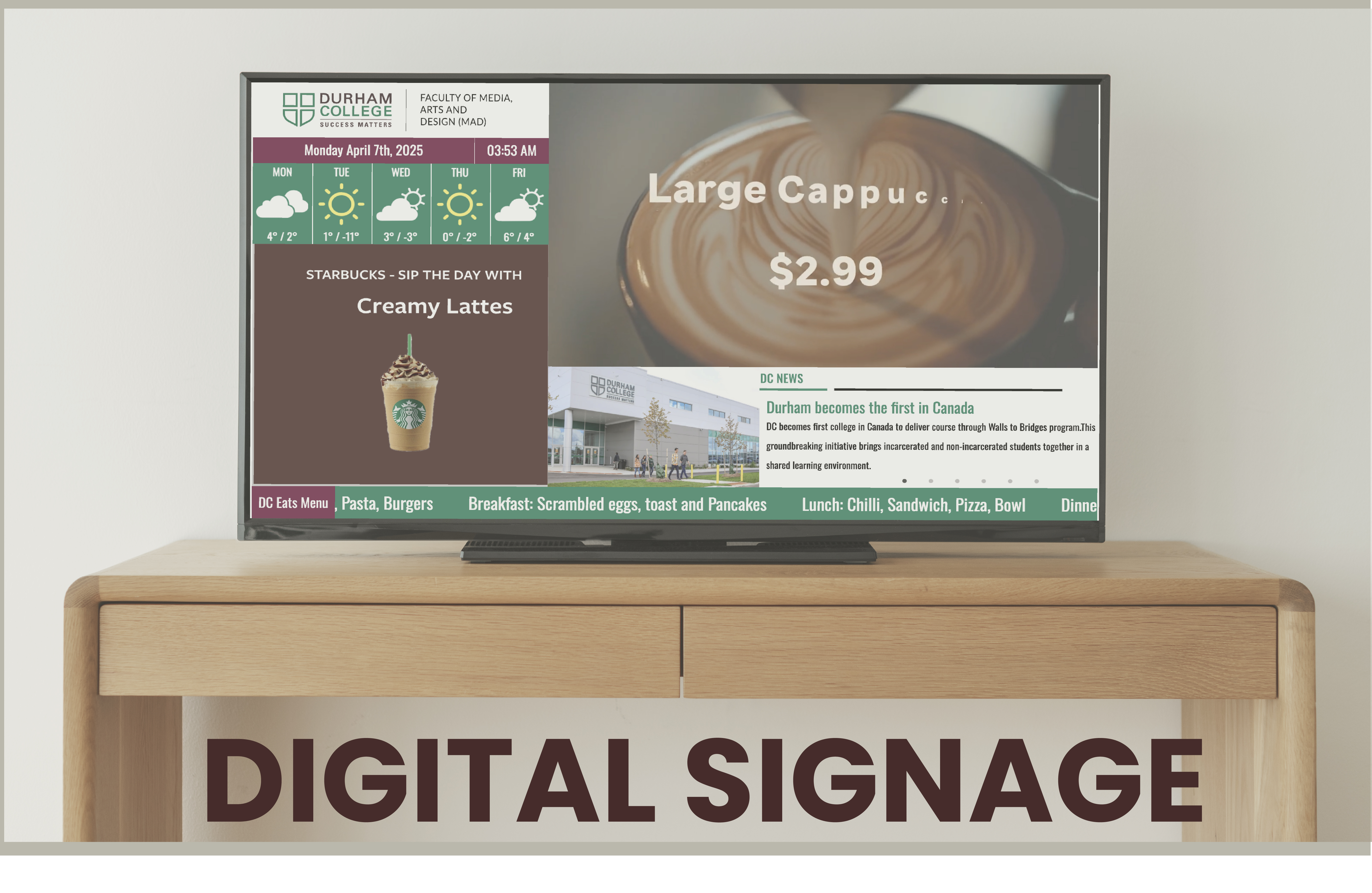
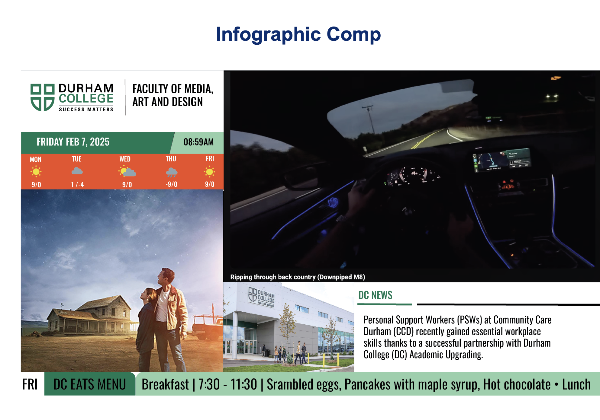
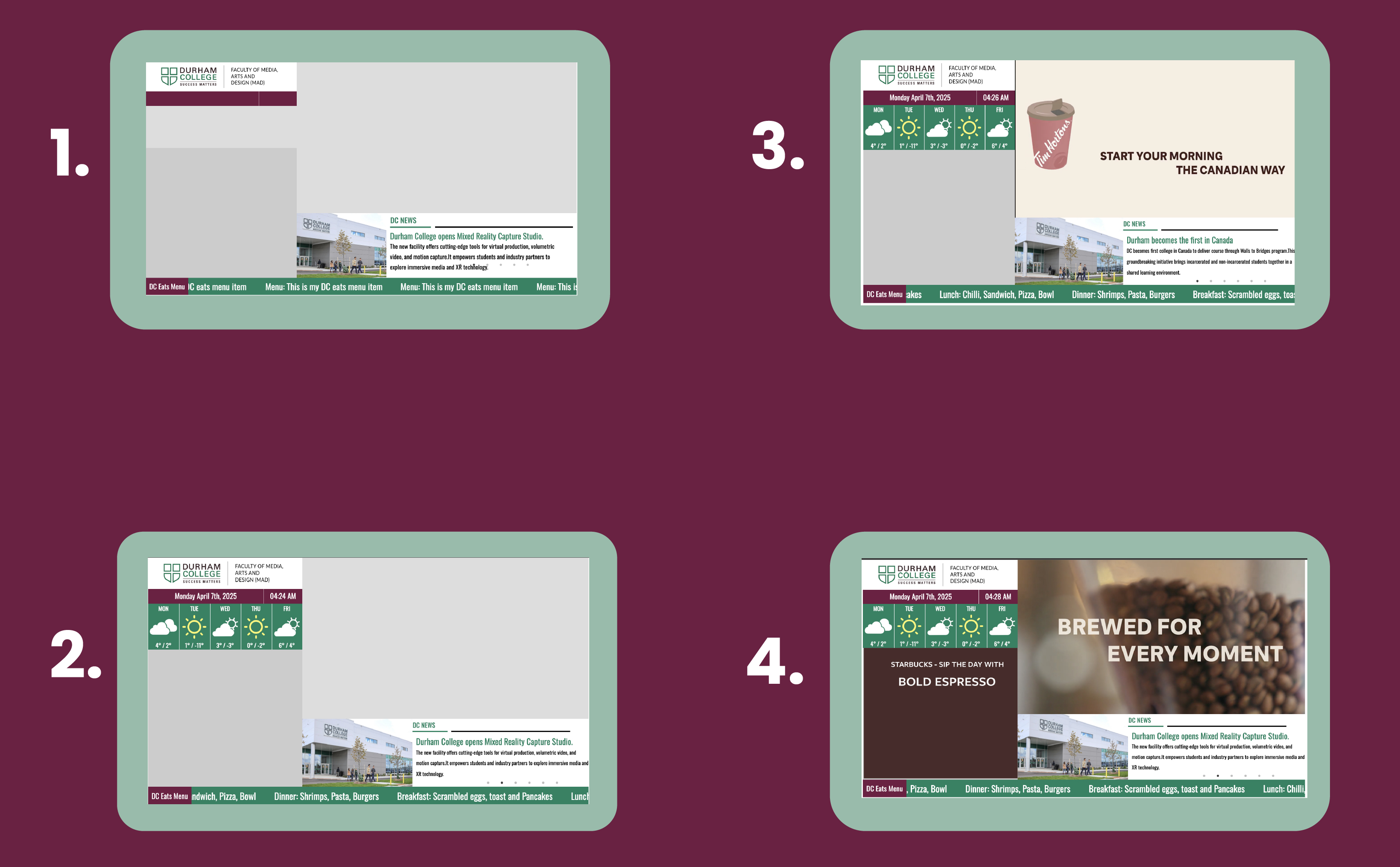
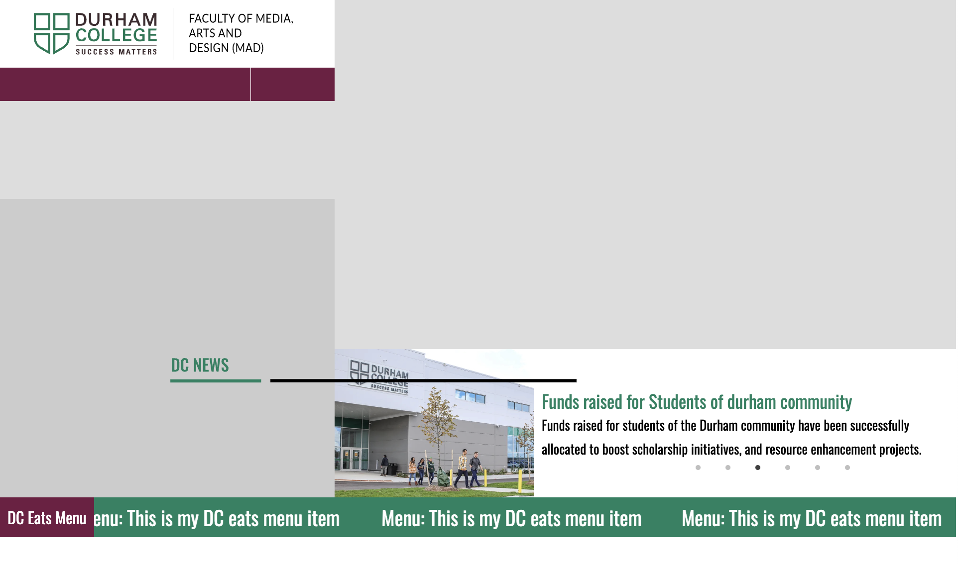
The design concept was to create a structured yet minimalistic layout that clearly organizes content into designated panes. The left column features the logo, a weather forecast, and a motion graphic placeholder, while the right column hosts a YouTube and a news pane. The bottom section displays a ticker tape with the DC Eats menu.
I focused on clean lines, ample whitespace, and consistent typography to reflect Durham College’s brand identity. Every pane was designed to be easily readable, with clearly defined sections that allow users to quickly access important information. The overall design maintains simplicity without sacrificing visual interest.
The Process
My process began by studying the Durham College brand guidelines and understanding the requirements of a digital signage display. I drafted several layout sketches and wireframes to determine the optimal pane structure that would accommodate all the necessary content. This phase was all about experimenting with different configurations while ensuring clarity and simplicity.
After finalizing the layout, I created high-fidelity digital mockups in Adobe Illustrator and Photoshop. Iterative feedback from peers and mentors helped refine the design, ensuring that each pane—ranging from the logo and weather display to the motion graphic, YouTube, and news sections—worked harmoniously within the 960px wide comp.
Challenges
One of the main challenges was ensuring that the comp adhered strictly to the specified pane structure while remaining visually engaging. Balancing multiple content elements—such as real-time data (date/time, weather), dynamic media placeholders, and scrolling ticker text—required careful planning. It was crucial to maintain a clear hierarchy so that no single element overwhelmed the others.
Another challenge was integrating the digital signage components seamlessly with Durham College’s brand identity. This meant using the correct fonts, colors, and visual styles across all panes. Iterative testing and revisions were necessary to achieve a design that was both functional and true to the brand.
Final Product
The final product is a meticulously designed digital signage COMP that effectively communicates essential information in a clean, organized layout. Each pane is clearly defined: the logo and weather details are presented in the left column, while the right column houses dynamic media such as YouTube content and news updates.
The bottom ticker tape continuously displays the DC Eats menu, adding an element of real-time information. Overall, the comp reflects a balance of functionality and visual appeal in full alignment with Durham College’s brand identity.